
Mapping online influence at ContentEd
It’s been just over a week since ContentEd 2019, so I hope that everyone’s had time to let the learnings from the conference settle in.
As ever, the conference hashtag on Twitter was filled with people sharing their experiences, their favourite quotes or slides from sessions, or pictures of the amazing view from the Dynamic Earth terrace. All of which means there was plenty going on when I created this year’s influence map of #ContentEd19 Twitter conversations.
ContentEd is full of marketing, communications, and social media professionals – as well as content strategists – so they’re bound to be talking online. But who were the most vocal commenters at the conference? Who were people talking about most? What was driving the education content strategy conversation this year?
Those at the conference might be interested to see who had the most impact, so we’ve made an influence map for you to peruse at your leisure…
This is what the map looks like without any of the names on:
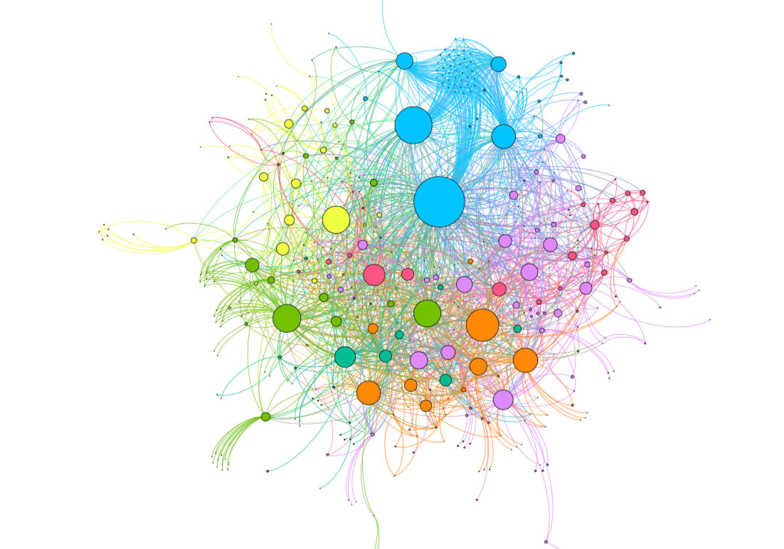
Adding names lets us see who and what people were talking about at the conference. Groups start to form around people and topics, and unexpected communities form around niche conversations.
The size of a dot shows how well connected an account is to other well-connected accounts. The better and more numerous its connections, the bigger it appears in the map. More densely connected groups of accounts are coloured the same for ease of identification. The more interconnected the conversations are, the closer they come to the centre of the map. That’s why you’ll see accounts like the official ContentEd account or the keynote speakers among the biggest and most connected accounts on the map.
Accounts aren’t influential just because they tweet a lot – it’s the engagements and conversations that matter most. The most interesting thing to me on this map is how interconnected all the conversations are – there are very few cliques or self-contained clusters. The community is having conversations and sharing information across expected boundaries, which is exactly what ContentEd is all about.
You can download the full PDF map to have a closer look (or to find yourself, we all know that’s what we want to do). And drop me a line on Twitter if you want to know more.
I created these maps as a fun way to look at the conversations taking place at the conference, but they have directly applicable uses for content strategy work, too – we can identify important online influencers to engage with, or assess our own impact on a particular topic. We can use it to understand more about a community we want to engage with, and find out what kind of content the community likes to share.
If you want to know more about this work you can read about our project with UCL or how we investigated research topics for SOAS. If you’d like a chat about how we might be able to help you look at other ways of assessing your institution’s influence and reputation, just get in touch. We’ll be happy to help.