
10 minute training: how to create accessible social media
Being accessible on social media just makes sense.
Accessible content is good for everyone. When you consider ways to ensure that people can adequately access and understand your content, everyone is more likely to access and understand it. It’s simple really. This post touches on some of the core elements of accessible practice on social media.
CamelCaseHashtags
We know that a lot of social media platforms use hashtags to group trends, organise content and feed algorithms.
Screen readers use camel case to interpret where words start and end as they read and ‘speak’ content. But think too about how we perceive words when they’re smushed together. Giving people access to your content, in this case, your hashtag is key to ensuring a swift and usable path to cognitive understanding.
The difference might be subtle for this example, but it’s impactful. We wrote a blog all about the importance of Camel Case hashtags, including some saucier examples of what can happen when we don’t adhere to this practice.
Alt text
Alt text is one element of accessible practice on social media that all platforms have taken seriously. All social media platforms that support static images now support alt text. This is brilliant news and makes it all the easier for you as a content professional to be adopting this practice.
Alt Text is an invisible description of a photo that a screen reader can read out loud with audio to people who are blind or visually impaired.
To write effective alt text is to write a short description of what the photo contains.
Include details that are significant to understanding the whole visual or post, but don’t worry about capturing excessive detail.
Alt text spaces are not appropriate spaces for SEO keywords, hashtags, or links (it’s not clickable)
Think about the context of your image
You don’t need to start your alt text with ‘a picture of’ or ‘an image of’
If your image is of a graphic, specifically one that contains lots of flattened text then remember that for that to be accessible you’ll need to include all the text in your alt text section.
Bad alt text:
A picture of a green pickle.
(pickle, pickled cucumbers, jar, vinegar, fork, pickled vegetables, #pickleback)

Good alt text:
A fork holds a pickled cucumber from a full jar of pickles
No click here
This is an accessibility practice that we may be familiar with from web content design. Click here is not considered descriptive, and is ineffective for a screen reader user.
Screen reader users often do not read the link within the context of the rest of the page. Using descriptive text properly explains the context of links to the screen reader user.
Screen reader users scan content for links, just like those users who don’t use screen readers. Overall, using descriptive link text improves the readability of your content, since everyone can easily scan for links and find what they're looking for.
How does it translate to social media?
Well, If your content is clear enough then you simply do not need ‘click here’ as a call to action.
Audiences can recognise links without this pointer. Also, consider the platform limitations stopping ‘click here being a useful tool for accessing your content. By putting a link in an Instagram caption, for example, a platform which notoriously does not support active links you’re creating a barrier to access. Consider the steps your user will need to take to access this link.
Either, they google it. Or, they copy the whole caption, paste it somewhere, extract the link, and paste it into their browser. That’s a lot of steps, why would you put your user through these steps to access your content?
Plain text
Writing in plain text is a two-pronged piece of advice.
Plain text means using the standard characters available on your keyboard. But most importantly it means you’re using them as they were intended.

You’ll have seen on social media examples of people using ASCCI (American Standard Code for Information Interchange) as a way to add decoration and create memes or ‘art’. But, have you ever heard how this ‘art’ can appear to someone who uses assistive technology?
A piece of ASCCI Art looks like this
But to a screen reader user it sounds like this
Making this content completely useless to a huge portion of users.
“But Cat, I really want to make ASCCI art..” I get that. Sometimes memes or trending content ideas DO use these inaccessible forms of communication. That doesn’t give you an excuse to use them, rather take it as a challenge to engage with them in an accessible way.
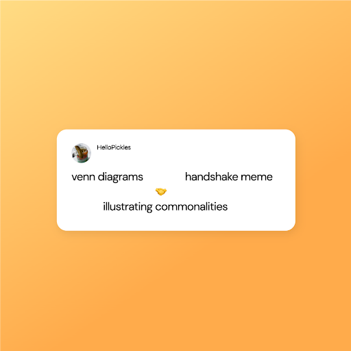
Alt text: screengrab of a tweet which says the following
Venn diagrams, handshake meme.
Handshake emoji.
Illustrating commonalities
Consider this popular Twitter meme, where a handshake emoji and excessive spacing is used to illustrate commonalities. For a screen reader user, this content might be inaccessible, or cause confusion when it’s read out loud.
Instead, consider taking a snapshot of your ASCCI or Emoji art and creating something like this with your own branding and post. You now have the option to include alt text to help illustrate the image.
Plain text can also refer to just using regularly spoken English. Avoiding jargon, technical language and complicated sentences means that people coming from different backgrounds, skill levels and contexts can gain value from your content.
Consider too what people are using social media for, Is your audience really going to take time to understand the niche context of your technical language as they’re scrolling through Instagram or Twitter?
The Hemmingway app is a great tool you can use to test how accessible your tone of voice is. It works to score content on readability, particularly in terms of identifying long and complex sentences that can be simplified and made easier to read.
Go light on the emojis
Emojis can be really fun ways to make your content feel exciting and engaging. But we need to be mindful of how we use them to ensure our content stays accessible.
The ALT descriptions for emojis sometimes don’t match the message we’re trying to send. For example are these clapping hands, or praying hands?
👏
You can check the emoji description by visiting Emojipedia.
When we think about users who access content via a screen reader we should also consider that many screen readers don’t read emojis at all. For that reason, we should avoid using emojis to replace text.
Whether your users access content via a screen reader or not we should be mindful of the placement of emojis. Try to keep to a pattern of keeping emojis at the end of your text. That way they don’t interfere with the content your user is trying to access.
When considering this point we also need to be using emojis sparingly, and as stand-alone, additional pieces of content. Rather than peppering them through text, or using a long string of emojis.
Emoji heavy:
Another great 👍thing about pickles 🥒is how nutritious they are😋. 🤔Did you know❓Drs say 👩⚕️that some foods help support the healthy bacteria🦠 in your gut🫃?
Emoji Light:
Another great thing about pickles is how nutritious they are.
Did you know, Drs say that some foods help support the healthy bacteria in your gut 🤔
Something else to consider when using emojis is how they might be interpreted. Whilst screenreaders may pick up the alt text and lead the reader to a literal interpretation we know that many emojis are not interpreted literally. Consider how you might interpret these emojis, and how your target audiences might interpret them, vs what they literally capture.
🤡 Literal meaning: Clown. Actual meaning: Someone acting foolish
👍Literal meaning: Thumbs up. Actual meaning: Gen Z recently labelled the thumbs-up emoji as hostile!
🍆Literal meaning: aubergine or eggplant. Actual meaning: we’ll let you google that one.
Captions
For a while now it’s been a marketing trend to include captioning of videos on social media because it allows all users to play videos in silent mode without bothering those around them. Whilst that’s true, Captions can be a powerful way to ensure your whole audience can access your content.
Captions are essential to serve those who are hard of hearing, it gives them access to the information in the video that other audience members might be able to hear. Consider the other groups that might benefit from being able to read captions.
Those with processing disorders like ADHD and Autism
Non-native speakers or those who struggle with accents
Those with other learning differences and difficulties
Open captions always are in view and cannot be turned off, whereas closed captions can be turned on and off by the viewer. So, which should you use?
Open captions might be helpful for the categories we described above. But, open captions are totally inaccessible for users using any kind of reading software such as blind users.
Closed captions are more accessible as they require some additional work. Social Media Platforms like Twitter and Facebook allow you to upload an SRT file when adding your closed captions. This means that your caption file is separate from your video and usually can be picked up by screen readers or assistive technologies.
Be aware that different platforms have different ‘safe spaces’ for captions and text.
If you’re someone who creates video content for various platforms why not create a template that shows exactly what screen space you have? You want to ensure that accessibility features like captions won’t be covered by profile badges, graphics, comments sections, or other accessibility elements like open captions.
Before you publish the video, make sure the captions are accessible:
Test
Include a transcript, srt file
Include a summary of the video
Keep in mind that captions don’t mean accessibility by default. There’s much more we can be doing to ensure content is accessible to all users. For example, audio descriptions are increasingly being seen in social media video content.
Ten minutes isn’t a long time to talk about what’s needed to make content accessible. If you think you or your team could benefit from some more guidance or training on accessible social media content then message Cat Prill.