
A-levels 2020: Mapping the online discourse
I’m not going to recap what’s happened over the past week in UK higher education. It would take more than a blog post to do that… suffice to say, there’s been a LOT of A-level and university application discourse on Twitter. To find out what was going on in these conversations (following our earlier social listening exercise) I decided to map them out. I used around 18,000 tweets over five days, and there’s some interesting stuff to look at.

First up: the circles are all Twitter accounts, the lines are an interaction of some kind. The more interactions an account gets, the bigger its circle becomes (so it’s not just about how many followers an account has, though that helps).
The big circles we can see on the right are Gavin Williamson and Ofqual, for obvious reasons. There are a lot of people tweeting at them, tweeting *about* them and – importantly – quote-retweeting them. There’s a nearby Boris Johnson circle, but it’s not quite so influential.

Over on the left of the map, we can find other influential accounts that stand as opposition to the Education Secretary and the exams regulator. These are the accounts of comedians, campaigners, and others who are critiquing the way the results have been handled.

What’s most interesting to me is the way the conversations and interactions are happening. Often with someone like a government minister we’d see a “halo” effect around their circle – indicating that others on Twitter are just retweeting them, not engaging in conversation. We don’t see that much in this map. Instead, we see Twitter users who are involving themselves with several accounts, multiple times. This is evidence of regular, interactive conversations – this is a topic that people are discussing, not just sharing an angry or funny tweet about and moving on.
Also worthy of note is the tangled mass of accounts and tweets in the middle of the map. Usually with these kind of topics we see disparate groups forming, with conversations taking place within groups and only one or two accounts connecting each group. What we see here is different – a large number of lines crisscrossing each other, linking lots of different accounts in different ways. This isn’t small groups talking in echo chambers – this is a topic that transcends those usual online boundaries.
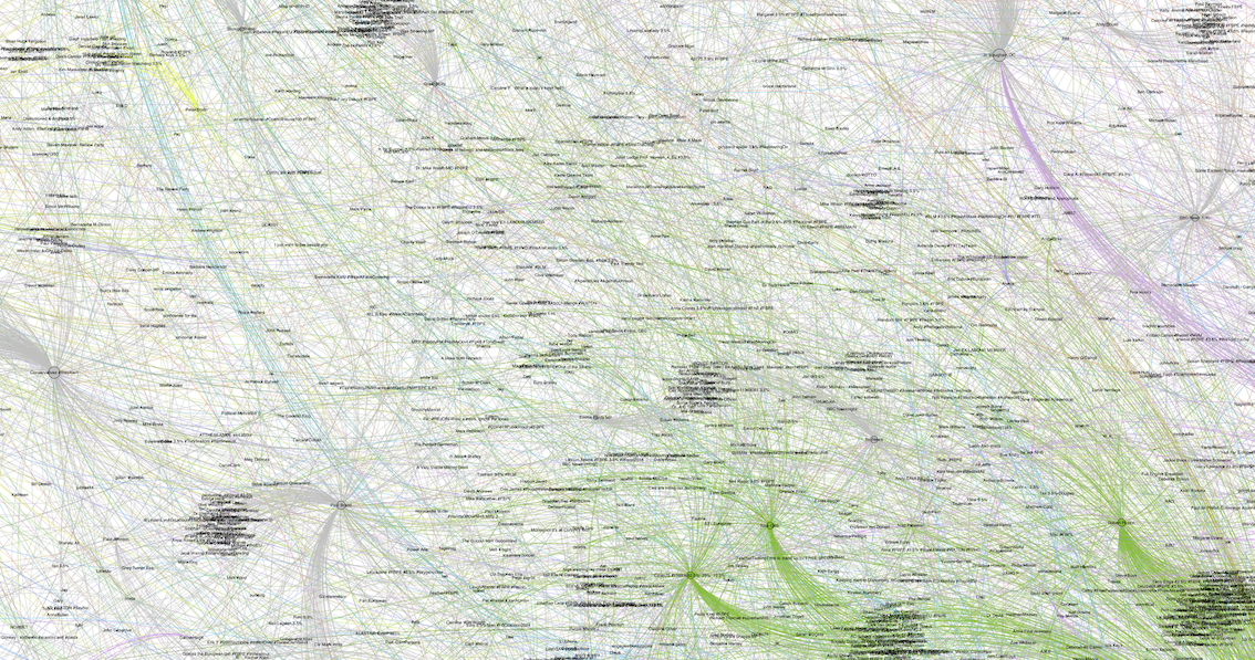
The other interesting thing here is who isn’t getting much attention – universities. There are quite a few universities on the map, but they’re mostly on the fringes, not involved in the main conversation. Right now, this is the best place to be… universities aren’t the target of students’ anger (that’s reserved for the government), so when a university is involved in a conversation on this topic, it’s usually the end of the discussion. The university Twitter accounts are able to address what’s coming up and take it offline – exactly the way it should be when dealing with intensely personal issues.

There’ll be more conversations – more emotion – over the coming days and weeks. The question now is whether students will turn their anger towards universities, or – as seems to be the case so far – the HE sector is able to demonstrate both its empathy for individual cases and its importance to society at large.
If you want more information on these maps and how you can use them in your communications planning, or if you want me to look at another topic for you, just drop us a line.