
Mapping online influence at #CASESMC 2018
Our Head of Research, Robert Perry, headed down to Brighton last week to join many other marketing, communications and social media professionals at the CASE Social Media Conference 2018 – you might have even watched his session on measuring and mapping social media influence.
We saw on Twitter that some of you were finding yourself on his map of the first day after his talk, so we thought we’d make it easier for you to see how influential you were at #CASEsmc and who you were communicating with online. You can see the full map here.

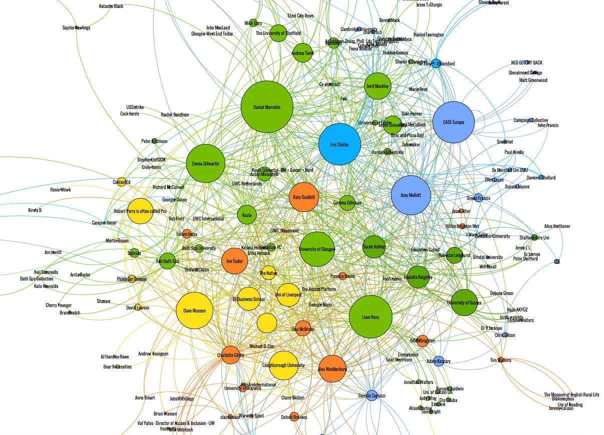
So first, a quick rundown on what these maps actually mean – the size of the circle represents the level of influence and interaction that you hold within the #CASEsmc community; and the different colours represent the various topics of discussion over the two days. For a far more detailed explanation of these maps, you can read our other blog posts for CEAC 2017, THEWAS and Wonkfest 2017.
Who was leading conversation at #CASESMC?
As expected, CASE Europe is relatively prominent in discussions of #CASEsmc, though more so at the outskirts of the main section of the map – as well as conference chairs Amy Mollett and Daniel Marrable. Interestingly, university accounts have also benefitted from the influence of their teams at the conference, for example University of Glasgow is at the very centre of the map. With a high representation of the UoG team at #CASEsmc 2018, from alumni and social media teams, it’s not surprising that Glasgow has such high prominence on this map.

It’s great to see not only the delegates and speakers of #CASEsmc on this, but also the institutions that they represent becoming involved in the conversation. We see Isabella Keighley and Rebecca Longhurst involved in the same sphere of influence as their university account, University of Sussex and another institution, BIMM, represented by their fellow co-speaker Nic Ledger. This dynamic of speakers and the institutions they are from can also be seen with Liam Ross close to his university account, Loughborough University, as well as Jord Muckley, and his university account, Aston University.

We see a similar grouping of related accounts in the map from day 1 of the conference, where the presenters from the Pecha Kucha-style 20/20 slideshows are all clustered at the top of the map. It’s really interesting to see just how this Twitter data can represent the reality of the conference.
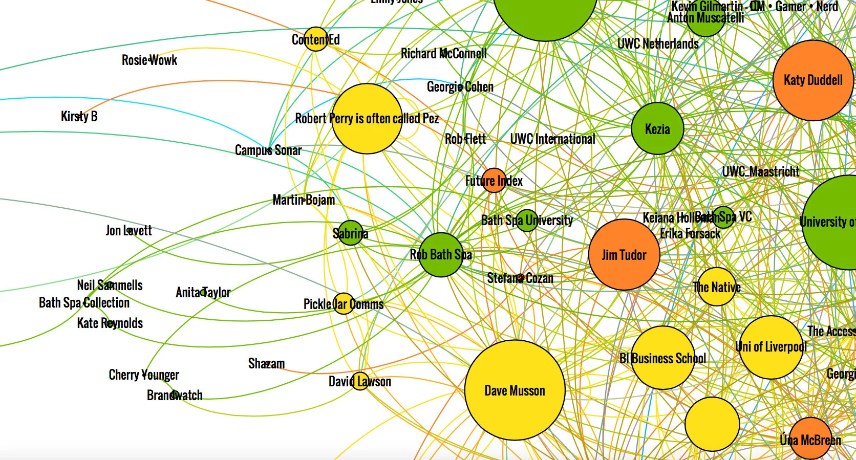
Though we’d like to have joined Robert in Brighton for a couple of days, we’re glad that we still made it on the map despite being all the way up in Newcastle. Robert – of course – has influence within this map, as a delegate but also as a result of his session on measuring and mapping online influence (funnily enough, the topic of this blog!). In the same area, Dave Musson, and his podcast The Native, occupy a influential position in the lower left of the map. As well as Dave, other speakers also hold prominent positions on the map, including Eric Stoller, Emma Gilmartin and Jim Tudor.
Mapping the prominent accounts in a topic like this gives us an insight into how online discussions develop, how communities form, and how online influence can spread far beyond simply the people with the highest follower count. Identifying the types of people who hold sway in a given field can help us work out what kind of content to create and how to target it.
If you want to know more about our influencer mapping work, drop Robert a line at robert@picklejarcommunications.com.